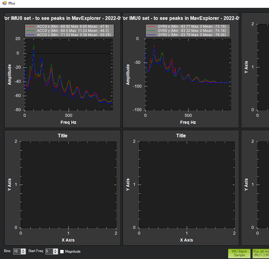
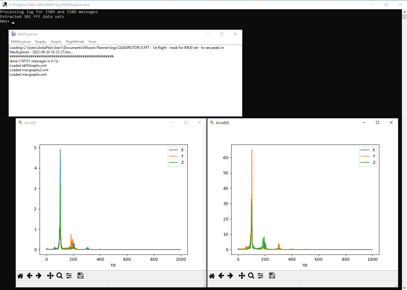
Working through enabling an FFT Harmonic Notch Filter again, I noticed that the Mission Planner charts have changed. For comparison, below are both the Mission Planner and MavExplorer charts.
As I recall, the Mission Planner charts used to look like the MavExplorer charts.
I’m sure the Mission Planner chart conveys good information - but I don’t know how to interpret it. Are there some docs that explain it?
They won’t change if you check the Magnitude checkbox on the lower left. What you are seeing is a log scale if you don’t check the box.
I suppose the screen shots should be updated on the “Measuring Vibration with IMU Batch Sampler” wiki page to highlight the checkbox box with a description. I would actually prefer a checkbox that says “Log Scale” and the alternative is the default.
Thank you Dave - This is exactly what I needed to know.
I did a little write-up on FFT - the simple multi-copter case - to help me get the details straight and to maybe help others starting out.
Seems to me that when I first did FFT the “magnitude” checkbox didn’t have to be checked - in fact, I don’t know if it was even there. Now that I know about it - easy peasy. And I’ll include it in my little write up.
If you don’t check “magnitude” - and get the “log scale” version of the graphs - I’d like to know how to use that depiction.
I’ve explored the new “Spectrogram” option - looks really interesting - but I’d need some guidance on understanding what it means. In particular, the x-axis is labeled “T” - I’m don’t know what that’s referring to.