Just getting into log analysis with Mission Planner.
I have reviewed “Downloading & Analyzing Data logs in Mission Planner” on ArduPilot.org site.
Just a couple quick questions.
-
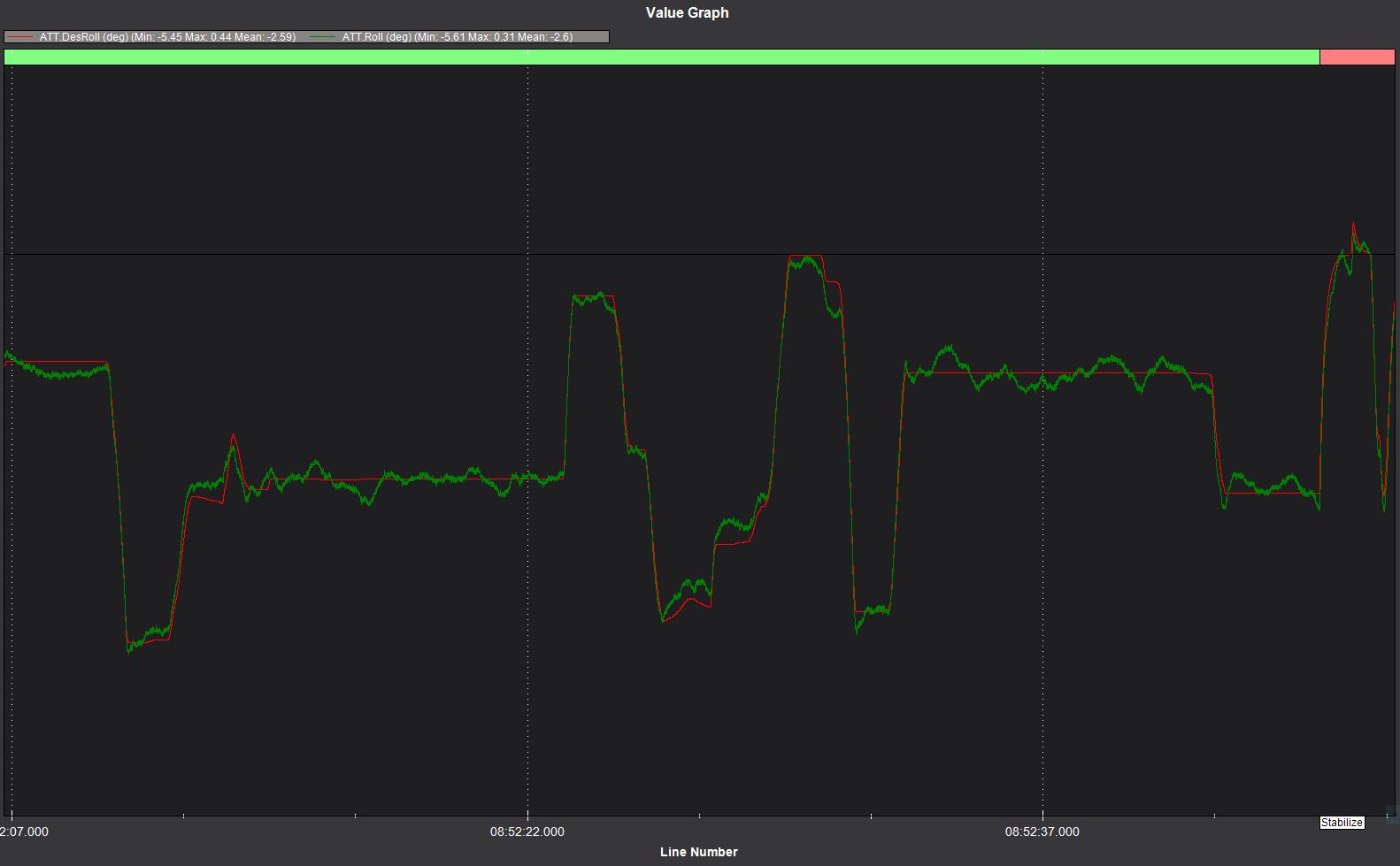
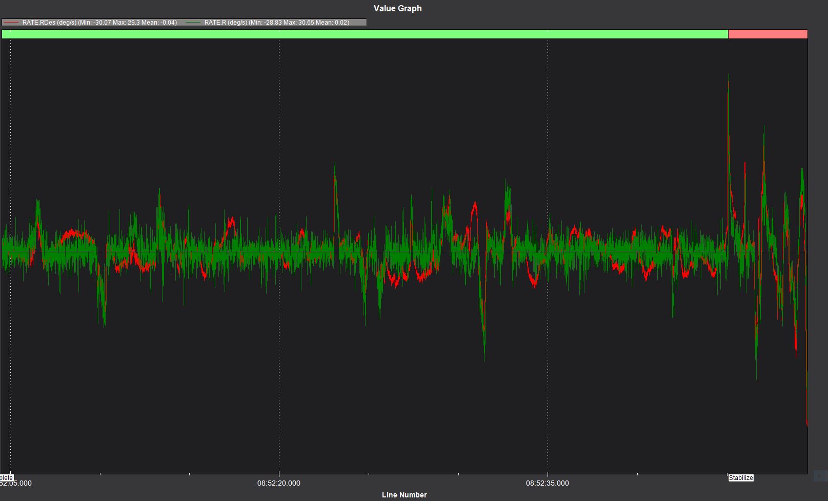
When viewing the “Rate” Log, you have Desired and Actual “Rates” (deg/sec) for the Roll, Pitch , and Yaw axes. Is the “Actual” Rate for each of these before or after filtering? The reason I ask is although the “Desired” and “Actual” ATT log graphs (Roll, Pitch and Yaw) for my current build very closely match, the Desired and Actual Rate log graphs appear not to match as closely. In fact, it appears the “Actual” Rate graphs appear “noisy.” However, when looking at both the FFT and VIBE graphs, there does not appear to be any significant noise at all. Perhaps, I’m just misunderstanding what it is I am looking at. ATT and RATE graphs are attached (Desire in red color, Actual in green color). ATT Fast logging (400Hz) was enabled to capture this data. Is this RATE graph “normal looking?” Copter flies nice with not noticeable issues.
-
What Log graphing options (if any) can I use to show me the “Before” and “After” filtering Gyro (Roll, Pitch, and Yaw axes)?
Thank you.