According to a recent facebook poll of the ardupilot.org group, we saw the following poll results. About 80% of the respondents said “Definitely.” Do you think anything should be done to address the results?
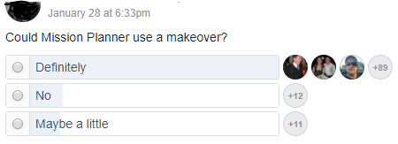
According to a recent facebook poll of the ardupilot.org group, we saw the following poll results. About 80% of the respondents said “Definitely.” Do you think anything should be done to address the results?
Yes I saw this but this is a little bit biased, its like asking: Would you like a 100% salary increase?
It would be really interesting to make a deeper analysis of what are the new features and what is not going well.
Jamie Machuca found an excellent study conducted by intel addressing what features are going well, etc.
To start with; get out of the 80’s and become a true multiplatform application.
Windows is not usable for serious stuff like GCS for BLOS.
95+% of users are using Windows, and anybody doing BLOS can use a more advanced suite (and probably pay for it too). I don’t think this solves the makeover problem, and I also don’t think it’s much of a feature/platform problem either.
I don’t think Facebook is the platform to poll users as to technical prowess.
I am using MP because it’s easy to use and because it’s like it “always” been. Please don’t change. Just add functionallity.
Of course the community is a little different over there, but maybe this is a bigger question for Ardupilot. Do you technical experts want to grow the community to include those less technically skilled people? I think that is a huge “market” for growth, and I think the ardupilot community should welcome a lot of those people that want an easier to use Mission Planner.
The problem is confusing Mission Planner with Ardupilot. You can’t really make 800 parameters easier. The complexity of Ardupilot is due to the fact that it can be used for almost any vehicle on land, sea or air. It is general purpose. To that end there is nothing you could do to improve Mission Planner except hide or turn off most of the features.
The original DJI Naza is easier to setup and use. It ends there. It is easier because you can’t do with it what you can do with Ardupilot.
There is no getting around putting in the time to learn Ardupilot if you want the return on investment.
I disagree that there is a “huge” market. DIY is getting diluted by the huge volume of RTF buyers who have no interest in building anything. It all started with nothing but DIY but as time goes on the percent of builders to appliance operators gets smaller and smaller.
Ardupilot will always be for advanced users, experimenters, professionals.
I respectfully disagree about making things easier. Sure 800 parameters are too much to set up, but most users can get flying with modifying less than 20. The default parameters are GREAT for ardupilot, and I firmly believe that the user interface is what makes ardupilot more difficult than necessary for new users.
I think over half of the users of ardupilot had no prior build experience with another autopilot, and most all would agree the learning curve is steep. I don’t think it needs to be so steep, and that starts with the user interface - Mission Planner.
How exactly are you going to “makeover” Mission Planner to make it easier to set the parameters you need. You currently get a list sorted by multiple views and a search function to find the parameters you need to set with descriptions of the value options. You get a series of calibration screens that make it easy to follow the procedure necessary to calibrate the IMU, compass and radio. How would you make those steps easier?
If you want Mission Planner to do those things for you it is not possible because Mission Planner knows nothing about your aircraft and has no way to find out.
Eh? Welcome to the 21st century. Windows is no longer the dominant platform, thankfully.
I actually think that’s one of the things that is holding this project back. Fewer and fewer people have windows these days - Macs, phones and tablets are the order of the day. apm_planner2 sadly seems to have been put to bed, and qgroundcontrol is a really nice cross platform GCS but it still needs work particularly with ardupilot. I keep a windows VM around literally for the sole purpose of running Mission Planner when I absolutely have to. Particularly as this project is more likely to attract technically competent/interested people, who are much more likely to be using Mac or Linux.
Totally agree with you here. There are for sure ways to make it easier, and it should be a priority to do so. As an example, I recently set up my Taranis controller from scratch for Arduplane. r/c controllers have always been this horrendously complex black box to me, but the most recent firmware they’ve added a nice friendly wizard to get you going, complete with pretty pictures and simple questions that walk you through the process of setting things up. We need more of that here.
I think a big step to make the steps easier would be making the user interface more aligned with other software. For example use a “ribbon” at the top and keep almost all of the buttons there. Microsoft has spent years studying UX, and so many users are familiar with the ribbon concept. I believe the current Mission Planner is boxy, confusing, and outdated. A few examples of things that don’t make sense to me are the following:
I think before Mission Planner gets a bunch of additional features, it needs to be organized appropriately. Only then should features change/be added. Build a sold backbone and then build on that. That structure isn’t there in my opinion. The independent study above proves that the features aren’t easy to use, and some features weren’t even known to users (they exist, but weren’t found for the study).
I don’t think that a few changes to the cosmetics is going to change the learning curve steepness. The ctrl-F is an example of trying to hide advanced features from beginners. The bottom line is there are a lot of things to learn. Your changes might make it easier for some to approach it but it is not going to stop having to learn those things.
I hardly think that poll is a valid survey of users.
I agree 100%, but that’s what the Wiki is for.
This isn’t about learning curve steepness or teaching new users. It’s about users wanting a cosmetic makeover. Not making anything easier. Not creating more features. They want a “makeover.”
Just because the polled users are not advanced users or active here doesn’t make the results any less valid. If anything, I think one of the more public polls to a great and large sample of users. I think that efforts should be made to do what users want, and I think this is what users want.
I understand and respect if you lead you to believe nothing needs to change.
With a project with very limited resources I am thankful that Michael as done such an outstanding job on creating a very usable and beneficial product for us that I did not have to pay to use. I am not concerned that the GUI is not up-to-date with whatever is fashionable at the moment. I will gladly spend the time to study and get to know it and how to take advantage of the features.
The “95% use windows” doesn’t seem like a fair argument, when the program is for Windows - it’s a bit like saying there is no reason for a Tower app on iOS, because 100% of Tower users are on Android. People who normally use another platform are either keeping an old/cheap Windows laptop around, or running Windows in a VM on their Mac/Linux machine (I’m doing the latter).
I’d rather be able to fire it up natively, than have a ribbon top bar or another layout of the tools. Easy cross-platform use would bring in more users IMO, whereas rejigging the UI immediately makes the existing MP documentation out of date.
Then you can use APM Planner which is multi-platform.
As with an UI, clutter is the first ‘organization’ needed.
‘In the field’ these days many using tablets and touch screen interfaces
of single letter commands to set way points, draw ‘circle’ mode with a finger and/or map touch to set way points etc. Even though screen res varies, circles on screen with letters for the keyboard are a great start.
Consider ‘grouping’ functions better in pop up windows that come up front and center for main function groups etc. The screen can have a lot more functionality built in.
The REAL trick to this is not adding controls, but adding controls that follow the minds way of viewing and doing what they want the qaud to do. As an automation (factory manufacturing and test automation) engineer (design the electronics AND writing the software to run it) for the last 30 years, has taught me well, we know what the software needs to do, but designing for the end user is almost another science altogether.
ptegler
ptegler