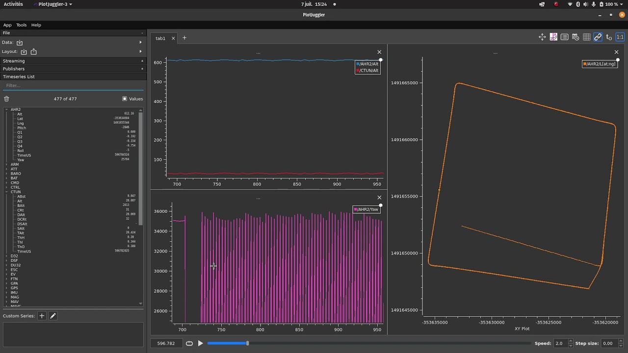
Plots
Who doesn’t like them? I don’t think there’s a single person who flew ArduPilot and hasn’t looked at a plot at least once. Battery consumption here… airspeed and throttle there… a target vs actual pitch over there…
Plots are part of the menu when we use ArduPilot, or any robotic system for that matter.
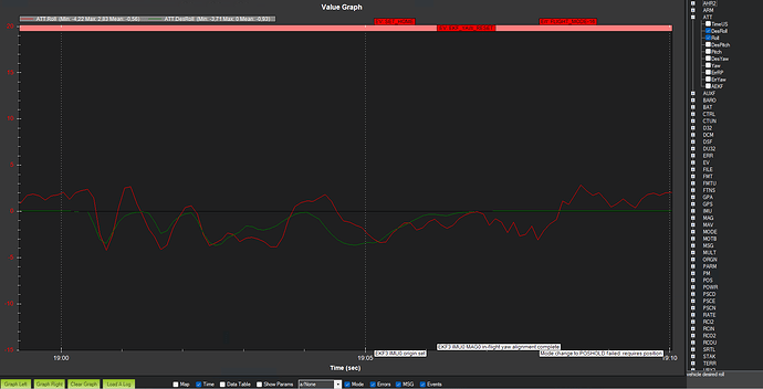
So, where do we get them from so far? I think it’s safe to bet everyone’s first ArduPilot plot was in Mission Planner. Its Tuning live logs screen is the bread and butter of many people who do in-flight tuning and the Review a Log functionality gives you the all familiar graph:
Pretty dark, I know. And personally I’ve always felt that Mission Planner is too clunky with its plot controls.
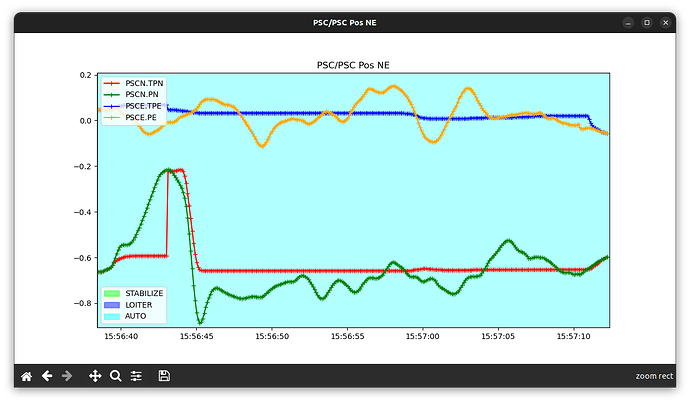
Then, there’s MAVExplorer and the MAVProxy graphing module. They both use the same library. It’s great for live plotting and comes with the ability to load and save graph profiles. They pop up in a new window like this:
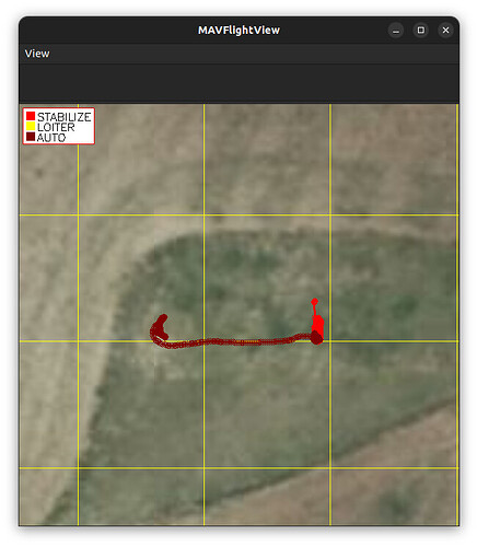
And the map view is very sexy-looking too:
I think many people don’t use MAVExplorer because it’s too close to a terminal application for their taste. It does require quite a bit of typing.
The reason I don’t use it that much is two-fold. It tends to take quite long to load big logs; I think its pure Python foundation shows here. And I also don’t like its plot display experience. Trying to load the same graph view over and over, then having to drag its window to its respective corner of my screen… it makes me tired. And it makes me create fewer plots. And we want more plots, not fewer.
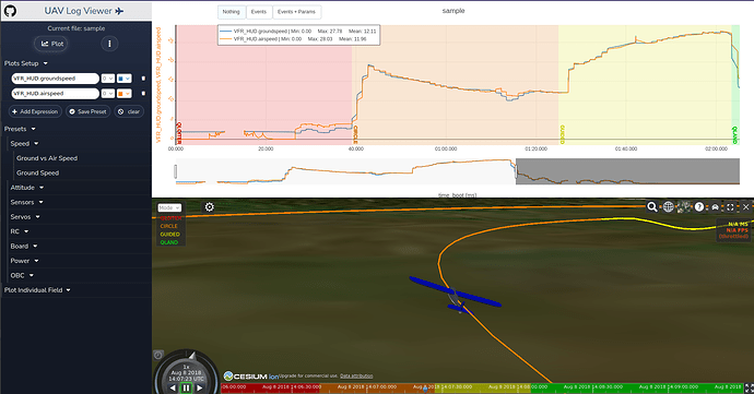
Finally, in the recent years we saw the rise of browser-based plotting tools. ArduPilot’s own UAV Log Viewer and its very sexy Ceasium 3D view is the prime example in my opinion. I’ve seen more and more people use it when posting screenshots.
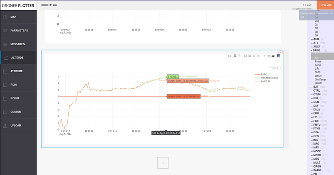
Dronee Plotter is another web-based tool. This one is 3rd party and closed-source, as far as I know. I don’t know much about it, I have to admit.
I also don’t know where my log ends up to when I upload it. I suspect it is processed only locally, but I can’t be sure.
But it does include a Parameter view and a messages view, which are very nice to have.
It comes with some stock plots, but you can’t save any presets.
I haven’t seen any for-pay tools being used to open and analyze ArduPilot logs, not in any serious extent worth the money.
Oh, I almost forgot! I have also co-written ardupilog, a .bin to Matlab log converter that is seeing a lot more use that I would expect.
But its plots are nothing to write home about.
There might be a few more tools that I’m missing, but…
Do you know of PlotJuggler?
It is an open-source C++ application written by Davide Faconti to do one thing and one thing only: Show you plots of your log.
It’s not built for ArduPilot in mind; it is a generic log plotter, providing native support for ROS/ROS2 live topics, .csv and .mcap files and .ulg PX4 logs as well. Yep, PX4 got in there before the author decided adding support for more log files was a pain and didn’t want to maintain them. But fret not! It allows for plugins and there already is one for ArduPilot .bin files. More on that later.
I suspect the target audience of PlotJuggler are mainly roboticists. And typically roboticists are professionals, not hobbyists. But automated vehicles definitely count as robotics and if I can help it more hobbyists will make use of PlotJuggler.
So, why is PlotJuggler so great?
First off, it’s FAST. It’s a compiled program and its author has gone to great lengths to make it efficient. He’s even made a talk on how he writes optimized code. I know I should have watched it already, but I plan to, I promise.
Loading a 300MB log will take about 10s.
It’s also very responsive. It’s UI is snappy with almost no lag from input to reaction. Drag, click, zoom… everything feels like an extension of your mouse pointer.
Finally, it serves you memes every time you launch it. What more could you ask for?
Installation
There are a couple of options here. For Ubuntu users there is a Snap store image and for Windows users there is an installer available.
Compiling from source is always an option too.
Now, the important part is the 3rd party plugin that adds support for ArduPilot .bin files.
It was written initially by @khancyr and it has now been passed to the Ardupilot organisation.
Unfortunately, it probably is also the weakest link in this toolchain, because you have to compile it yourself.
And to make things worse, currently there are no instructions to compile it for Windows, so a huge portion of the userbase is excluded.
Hopefully this drawback will soon be amended.
If you compile it yourself, I do recommend un-commenting the #define LABEL_WITH_UNIT option. It might make your plots slightly more brittle, but it is a big improvement in User Experience.
Once you compile the libDataAPBin.so plugin, place it in a folder where PlotJuggler can load it on startup. The App->Preferences->Plugins menu allows you to configure these paths.
Usage
If you made it thus far, we’re off to the races!
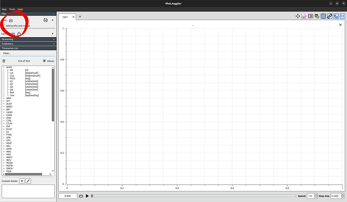
Load a log and see all of the logged topics and their fields on the left, along with their units (where they have been documented in the code).
You can search for topics and fields in the Filter field.
![]() You can load only
You can load only .bin files, not .BIN files. ![]()
This is because of how PlotJuggler itself works, not a shortcoming of the plugin.
There is a ticket open about it, but for now we’ll have to deal with this constraint by renaming our log files.
The rest of the ArduPilot tools don’t care about the ending anyways.
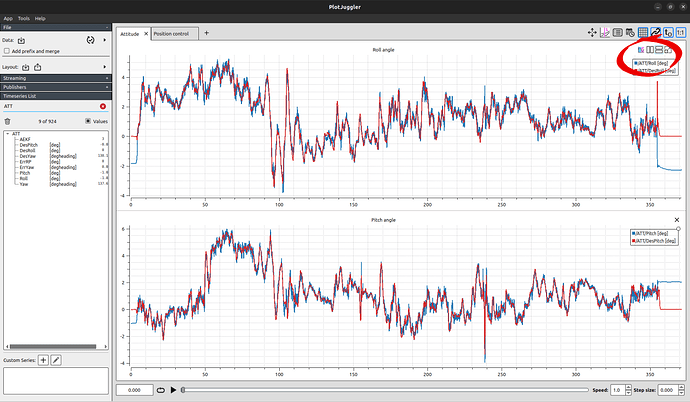
To plot a timeseries, drag it from the left to a grid. Then drag a few more. Then name your plot by double-clicking the ellipses (...)
You want another plot next to it? Split the view as many times as you like.
Not enough screen real estate? You can create a new tab and name that too!
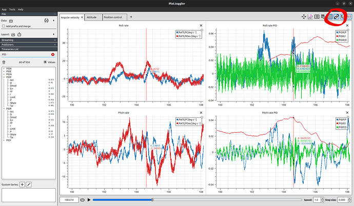
You can zoom in and out and all of the plots will share the same time axis. Just make sure you enable the corresponding option.
Shift+click anywhere on a plot and you will place a time-cursor. And the best part: This time-cursor will be moved to the same time instance in all plots!
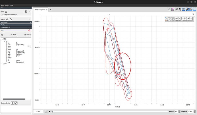
Wanna plot two timeseries in X-Y fashion? Select them both and drag them on a grid with the right-mouse button.
![]() By default you can’t X-Y plot two timeseries from different topics, because they don’t share the same time axis.
By default you can’t X-Y plot two timeseries from different topics, because they don’t share the same time axis.
But that can be circumvented by resampling a timeseries on the time axis of another.
More on that later.
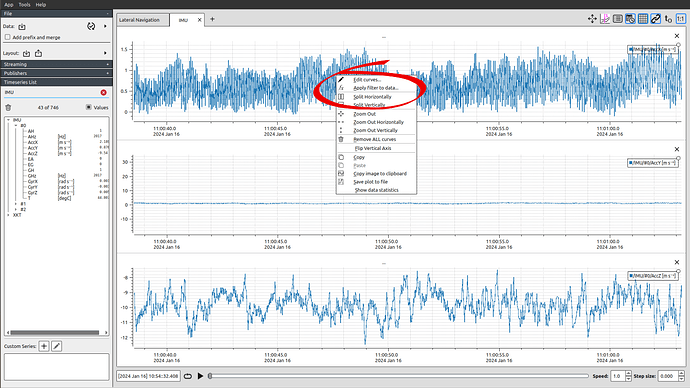
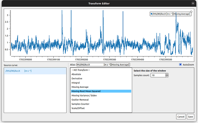
How about some data manipulation? Open the Apply filter to data context menu and you can choose among derivatives, integrals, scale, offset and more!
How could this possibly become better? How about some scripting… Lua scripting!
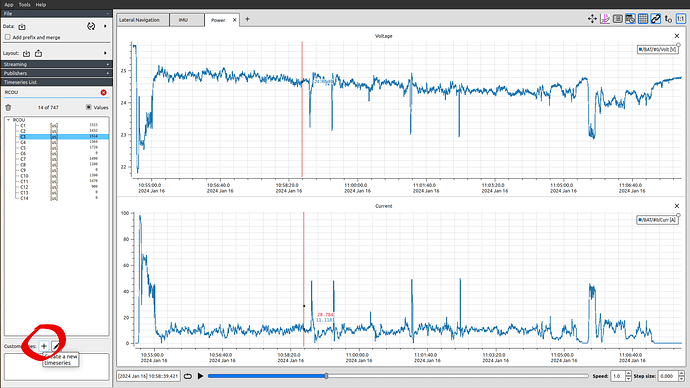
PlotJuggler allows you to generate new custom timeseries by using the Lua language we all love.
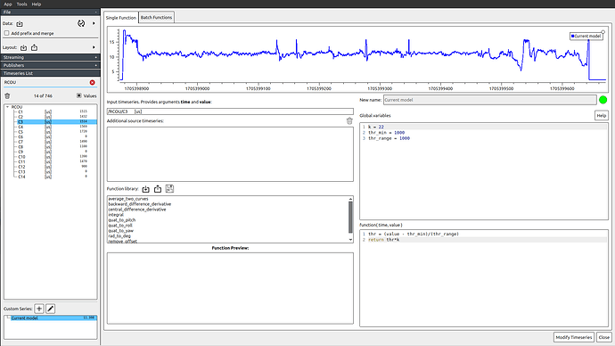
Select the topic you want to use as the basis of your timestamps and create a new Custom Series.
You can then drag as many signals as you want in the Additional source timeseries box. You can use these fields by the value, v1, v2, … names.
You also have time to the time value.
As for the script itself, anything goes. The idea is that for each timestamp you have to use the values that are available to you to calculate and return a single value that will be the value of the new series at that timestamp.
Plenty of templates are given by default, including the venerable quaternion to Euler angles transformation.
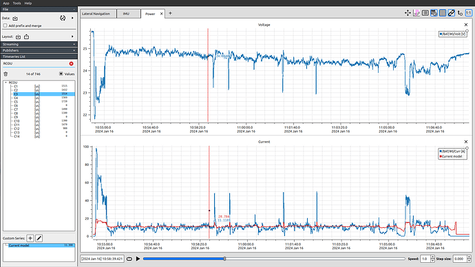
This is how we can easily make an attempt at a current draw model using the throttle output.
Similarly, you can easily resample (in the most crude way) a signal by using the one with the target timestamps as value and the one to be resampled as v1.
Build the new signal by simply return v1, at the timestamps of value.
Layouts
Now all of that is fine and all, but in my typical workflow involves plotting hundreds of timeseries, carefully creating, naming and moving my graphs and tabs, filtering signals and creating new custom series using Lua scripts.
Surely I’m not expected to do this every time I open a new plot, right?
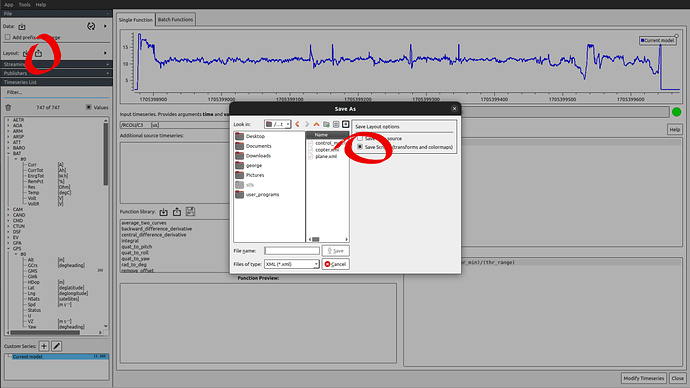
Right! When you’re done creating the layout of your graphs, you can export it into an .xml file.
Just make sure to save the scripts as well. Don’t save the data source, you want this layout to be applicable to all log files.
I have started a repository to share my own layouts. I try to keep them up to date as much as I can.
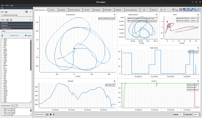
Here’s the first thing I see when I start my log analyses:
Feel free to use them as inspiration for your layouts!
When you want to open a new log, simply load the layout you saved.
This unties your hands and lets you create very complex, polished layouts and have them reproduced in every log you open!
All the plots, all the tabs, at the same time, every time.
Now, there are some caveats here. First of all, what happens when the layout you had saved was using a topic that doesn’t exist in this other log?
This can happen, for example, when this one Copter doesn’t have a rangefinder and doesn’t log its readings.
In this case you’ll get a warning that the timeseries doesn’t exist.
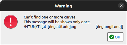
Simple enough. But be careful! Now PlotJuggler will not include this timeseries in its plots, so if you try to save the layout anew it will not be plotted ever again!
Which brings us to the biggest pain point I have right now with PlotJuggler.
I’m using git as a version control strategy to monitor and avoid situations exactly like the one above.
As part of my workflow, I export the layout file, overwriting the previous version and have git show me what’s changed.
The idea is that I will stage and commit the new plots, ignore the deleted, missing timeseries and finally reset these unstaged changes.
But .xml files present an extra difficulty: the attributes of elements are not guaranteed to be in a deterministic order.
Notice how between saves the flip_x, flip_y, mode and style attributes have swapped positions. Their values are essentially the same, but git thinks something’s changed.
What is more, the axes limits are also saved. This is essentially a state we can ignore between logs, but it also shows as a change in every single plot definition!
This makes it very hard to inspect the rest of the file changes and find what should be added and what should be reset.
To combat the sorting problem, I have created a Python script to sort the attributes before trying to use git and commit the file.
But for ignoring insignificant changes… I haven’t found a solution yet.
Some more gotchas
PlotJuggler isn’t a perfect tool by any means. Here are some more pitfalls and how I go around them.
When you have a log and layout loaded you can still load a new one, in the same PlotJuggler instance.
It should overwrite the old values and plot the new ones. But you will get this message first.
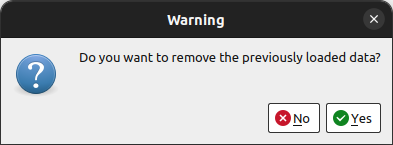
I typically click “No” here. The old timeseries will still be replaced by the new ones with the same name.
But if the old log had a topic that the new one doesn’t, it will persist and you will have data from two different logs at the same time.
Had you clicked “Yes”, you will actually lose all of your custom timeseries and you’ll have to load the layout file again in order to rebuild them.
Which brings us to another issue. When you have a log loaded and you load another one on top of it, PlotJuggler will take a very long time to load the second one, while it will be unresponsive in the meantime.
Depending on your logs, you might be better off spawning a new PlotJuggler instance to open the new log.
I believe this is a shortcoming of the ArduPilot plugin, because the PX4 loader doesn’t suffer for the same problem.
I am also jealous of the messages and parameters view that the PX4 loader has and the ArduPilot plugin doesn’t show.
Closing remarks
PlotJuggler is my go-to tool to inspect an ArduPilot log and I use it daily. I feel it accelerates my workflow and streamlines my process.
I think more people should know about it and I hope that could bring more momentum behind the ArduPilot plugin and improve it.
Looking forward to see how you will use it!

