I actually completely agree with this! It’s a really nice, clear layout - would much prefer to see a passthrough version of this.
I would prefer that the passthrough telemetry variables simply, or also, be made available for selection to a plain vanilla text screen. The graphic screens are nice but busy and sometimes you just need a few things showing. However, I did purchase C&T’s Flight Deck and am happy with the purchase.
sorry for you but take in consideration that there is not 1000 ways to display an artificial horizon…
I beg to differ. There are literally thousands of designs: https://www.google.com/search?q=artificial+horizon&tbm=isch
It can be displayed on the left, right, center, top, bottom, full screen, 2/3rds of screen, 1/3 of screen, in a corner, with or without overlay, in a square frame, in a circle frame, full height, 80% height, 50% height… virtually endless ways of laying out the interface. yaapu not only is aware of our design, but also recognizes that there could be objections about the layout, considering it’s so similar. Easy fix, make a different layout that’s not similar to ours, but rather an original creative work.
makes a lot of difference…
So to be clear because you think our business model is not Shark Tank worthy, we shouldn’t be entitled to Copyright protections for our creative work?
Thanks fnoop! Your kinds words are appreciated.
Also frsky documentation can be improved, would be great to have more contributions. Those wikis aren’t fixed in stone. 
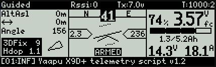
Here is my script for an X12s:
The layout is really lacking any effort, it’s more of a proof of concept to see if I could read the data via passthrough telemetry. Anyone is welcome to use / modify / improve / redistribute my LUA script.
I actually considered buying the flightdeck from C&T, but unfortunately last time I checked they still had no script for the X12s.
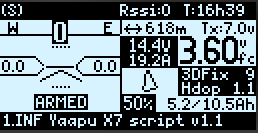
I’m about to release a version of the script with a revised layout
The idea is that most of the valuable information is on the right where human eye naturally tends to “point”
The c&t look and feel should be “safe” this way
As for the QX7 version, the room on screen is very little so it will be hard to make it “clearly” different from the c&t version but I’ll try.
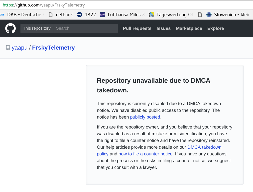
The original repository has been taken down upon request from C&T
that’s a nice project I was also doing something similar using my code base but you came in first  nice work!
thank you I hope it will be of some use for someone.
Hi Alessandro, i agree, now the layout is different, so I think there will not be any problems.
Cheers,
Marco
I’m reviewing the QX7 layout and I must admit that I do not see the “c&t look” in here unless they hold a copyright on having a hud on the left and values on the righ regardless of their shape/order
@tomlauzon
DMCA take down notice - seriously?
That sounds like a very promising PR strategy to make new friends (and customers) in an open source community 
3 Likes
Hi all, the new version of the script is on github
Hey yaapu, it’s great that you came out with this new version. It’s looking good. Had to do the notice because your look was too similar to ours, and we didn’t see any response.
There are still a few items that we think are similar. It would be great if you could change them:
- Battery gauge style and style of the 1.3/5.2A (we worked alot of hours to come up with this horizontal gauge with markings that would make it easy to tell where the battery level was.
- Bottom bar with the message number, severity messages and brackets. That’s really close to ours, especially the brackets.
See this example:
![]()
![]()
It’s really important so that users are clearly able to distinguish that this isn’t FlightDeck and that FlightDeck isn’t your FrskyTelemetryScript.
Do you think you could make these small changes?
Other than that, great work. Your script will provide more choices to people and bring more people to the Taranis.
Also please get in touch with us if you would like to work on some dev with us. I like the work that you did and we got a list of Taranis app projects that we are looking for coders to help with. Would be great to chat.
yep.
I think opensource people are more aware of copyright issues and licenses than the general public. Even in opensource there are licensing issues. Often it happens when authorship has been removed or copyrighted images have been reused improperly. It’s normal to defend one’s license. Otherwise, why even have licenses?
It’s not a huge issue, all yaapu has to do is change the look and maybe some features and users will have a new Taranis GCS. That’s more options! That’s better than having two of the same.
Just tried the old version 1 hour ago on my q x7, works just perfectly, cannot wait loading the new version, good job!
thanks for the support!
Hi Thomas,
horizontal gauges are part of the basic lua lcd library, so your “customization” with dots at 25,50 and 75 does not appear to be “c&t original look” to me even if it took hours to design, but I’ll look for a better alternative and maybe I’ll change it.
Unfortunately there is no other way to express a fraction between two numbers horizontally, so I think it will stay these way, there’s not much to be creative about!
Talking about the message bar I don’t think that anybody would exchange my script for yours just by looking at it, messages are just that messages.
Don’t take it wrong but accepting all your “little” changes would imply that you have complete control of my code and no developer would accept that!
Finally I must decline your offer for collaboration.
4 Likes